new site();


Note: I wrote this a long, long time ago. I'm sure there are better alternatives than this now. I leave it here because it's often linked to and because I thought it was kind of clever at the time.
Wrapping text around objects is easy when those objects are rectangles. Everything changes, however, when you want to wrap text around something that isn't a rectangle.
As with everything else in this discipline, there are a number of different ways to address this issue, and there are pros and cons to each. You could use a div per line, and that way you would control how the lines are breaking--but then if the user has their fonts set to a certain size, or if you are using a font stack, things might line up differently for different people. Editing the text later would be an awful pain.
You could also represent all the text graphically, but then there are problems with search--plus nobody can resize your text, which hurts your site's accessibility.
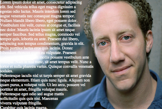
If your shape is not terribly complex and precision is not an issue, there is a tool online that will do this for you automatically. But, for more careful control of the output, not to mention the deep satisfaction that comes from doing things yourself, you can roll your own. To illustrate this, I'll put some text to the left of a man's face, and create a wrap that will form a contour around it.
 In this example I'll be wrapping text around a headshot that I found searching for "headshot" on Google Images. (Everyone here agrees that this is someone famous but we can't put our finger on who he is.) For this example I want to put text along the left side, wrapping around but not covering his head.
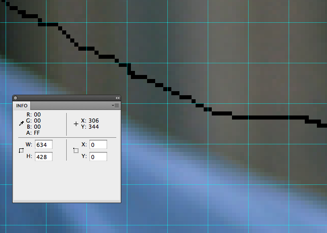
The easiest way I found to do this is to open the image in Fireworks or any other editing program, show the grid, and set the grid so that there is some sensible distance between lines. I chose 10px. Then, because the easiest way to measure distance is left to right, I flipped the image around. Using the pencil tool, and taking about a 5px padding into account, I drew a bounding line that represented to me where I thought the text should end.
Now just create a list. You want to measure the width of the thing you want to wrap around, every 10 pixels (or 15, or 5--it's a balance between precision and administrative complication). I just used the info window and moused over the line I drew at the right height, then wrote the x value on a piece of paper.
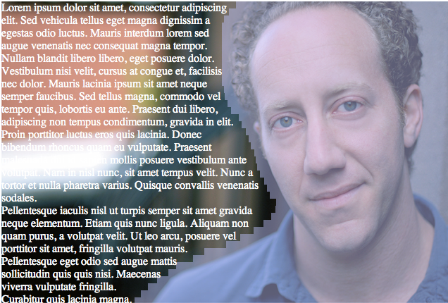
 To give you an idea of what we're trying to do, look at this picture with the pink bars-- each of the pink bars represents one of the measurements you've taken here, and one of the divs you create in the next step. We are just trying to make a series of narrow rectangles that approximate the shape we're trying to wrap around. The pink tone comes from a tint I added to the image in each of these divs, which isn't a half-bad idea if you want to see how things are coming along. I suggest you do this instead of adding a border to the div, because the border also adds to the thickness of each bar and over the course of thirty or so it really gets everything out of whack and you'll think you did everything wrong.
Again, for this project we have the text at left and the picture at right, but I flipped the picture around so that I could measure more easily from the left. You can measure from the right too if you like, and if it's less confusing.
So next you need some markup. This is what my page looks like:
<body>
   <div id="wrapper">
      <div class="spacer"><img src="spacer.gif" width="301" height="10"></img></div>
      <div class="spacer"><img src="spacer.gif" width="311" height="10"></img></div>
      <div class="spacer"><img src="spacer.gif" width="318" height="10"></img></div>
   .
   .
   .
      <p>
      Lorem ipsum dolor sit amet, consectetur adipiscing elit. Sed vehicula tellus eget
      magna dignissim a egestas odio luctus. Mauris interdum lorem sed augue venenatis
      nec consequat magna tempor. Nullam blandit libero libero, eget posuere dolor. Vestibulum
   .
   .
   .
      </p>
   </div>
</body>
 As you can see, I have a wrapper div, then a series of spacers, then some text. The spacer divs are obviously going to be of different widths, corresponding to the list you gathered above. The heights are 10px because that is the interval I used when measuring on the image in Fireworks. I saved some time by occasionally combining two spacers that had a similar width and doubling the height, but it doesn't really matter whether you do this or not. The spacers push the text out the desired amount, and because you can keep all your text together you can fiddle with the fonts and the size and whatever you like without having to change anything else in the div.
So all you need now, to create the wrapping effect, is the CSS:
#wrapper {
    width:634px;
    height:428px;
    display:block;
    background-image:url("headshot.jpg");
}
.spacer{
    display:block;
    float:right;
    clear:right;
}
p {
    display:inline;
    color:#FFF;
}
And that's all there is to it.