new site();


We on the Growth Innovations team spent most of this past year working on an Outlook add-in module that would allow clients to interact with their matters in Passport without having to use the web UI. By placing an interaction point with Passport directly in the application they are sure to have open all the time, we help them incorporate the ecosystem in their workflow in a much more streamlined and efficient way.
This project exposed all of us on the team to AngularJS, COM, and Microsoft's UI Fabric, while providing new challenges in building and deployment using Node.js and Jenkins. Plus, we got to be in the video:
Wolters Kluwer ELM Solutions Passport Office Companion from ELM Solutions on Vimeo.
 I spent about two years as one of many developers working on a huge project to refresh the UI of TyMetrix 360, TyMetrix's flagship matter and spend management application. We also had to make it work in browsers that weren't IE6, which presented a great number of challenges, as it was written for IE5.
This was my first exposure to enterprise software development and I learned countless lessons from the experience. Best of all, and despite numerous setbacks, we pulled it off--the design changes got done, and the cross-browser library we had to write worked beautifully.
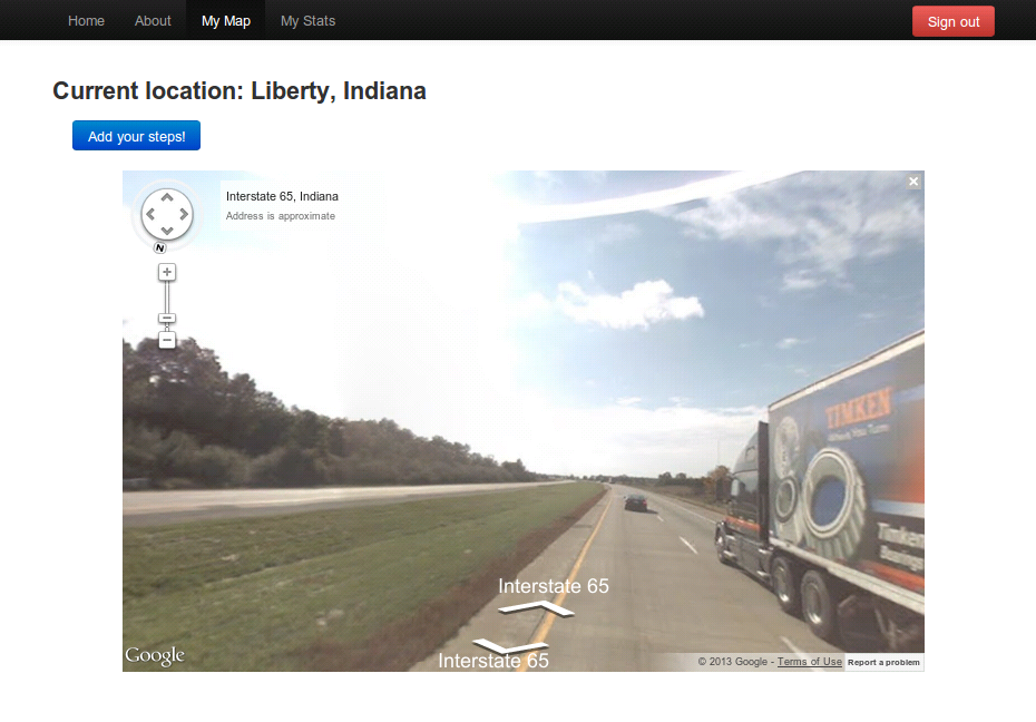 Some time ago I was an avid runner, and thought of a neat way to keep motivated: keep track of all my steps and try to run the equivalent of the width of the United States. The result is this web application, which is sadly always one feature away from deployment at a given time. (For that reason, clicking the image to the right will take you to a screenshot of the site on my local machine.)
The application stores each user's steps in a database, and allows them to add more steps, check their statistics, and most importantly, shows their progress on a route plotted across the US on Google Maps. It's a real route, and I keep trying to find ways to have the app make fewer calls to the Google Maps API.
I'm currently working on creating achievements for it, as well as a feature to automatically e-mail users who haven't logged steps in a while.
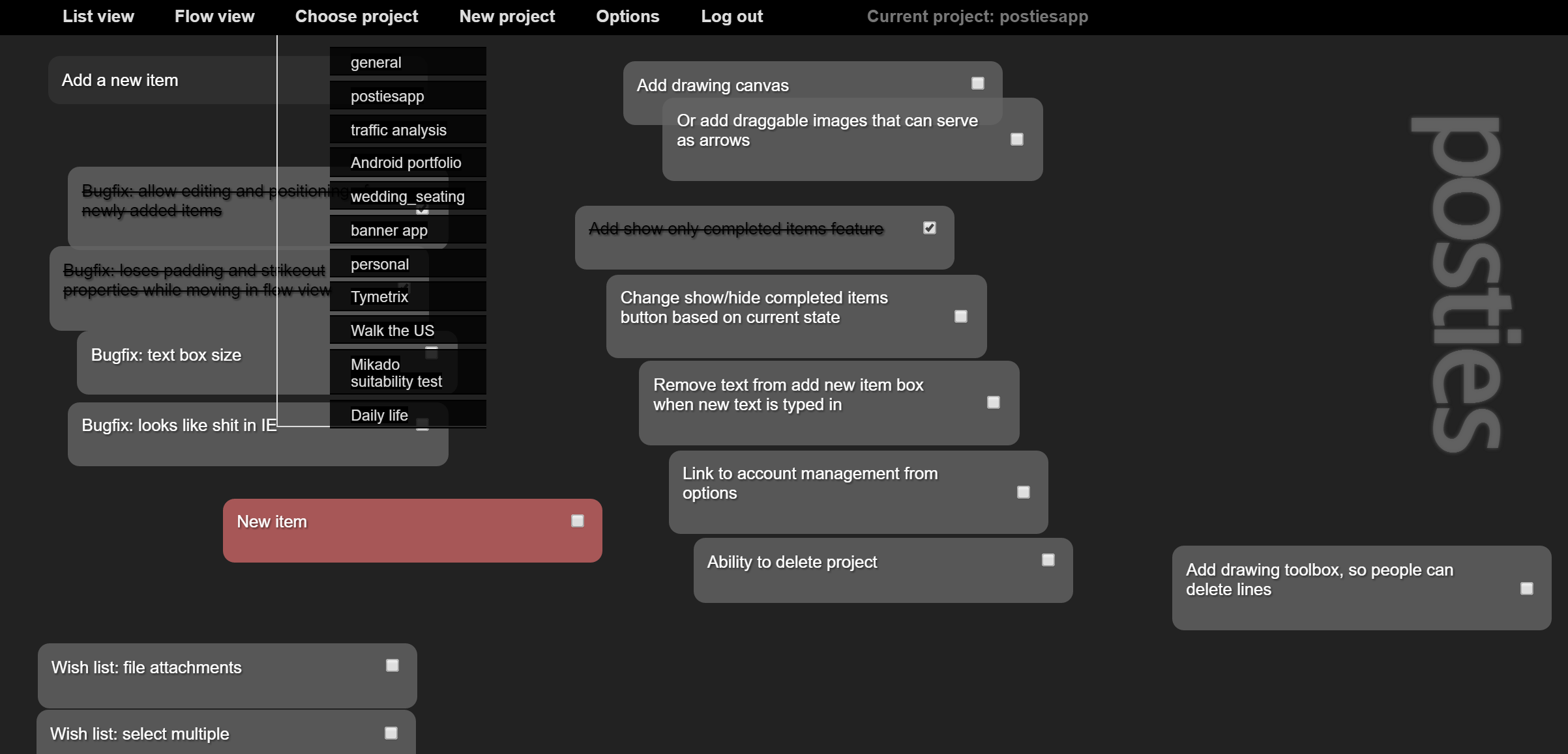 When mapping out project flow in the beginning of a project, I used to use post-it notes stuck to lengths of paper I'd taped together, and arrows and checkboxes and all that stuff. It looked like a total mess and was hard to share with other people. I decided to whip up an Ajax-based web app that would give me the same feel as the post-it notes, while allowing me to view it from anywhere and saving my changes as I went along.
The result was Posties, which allows you to post, sort, arrange, update, mark as complete, and remove small notes—organized in as many different projects as you like. I made it multi-user, so anyone can create an account and start using it. There's a normal list view, which shows all the notes in a list, and the flow view which lets you move them around to group them together, just like post-it notes.
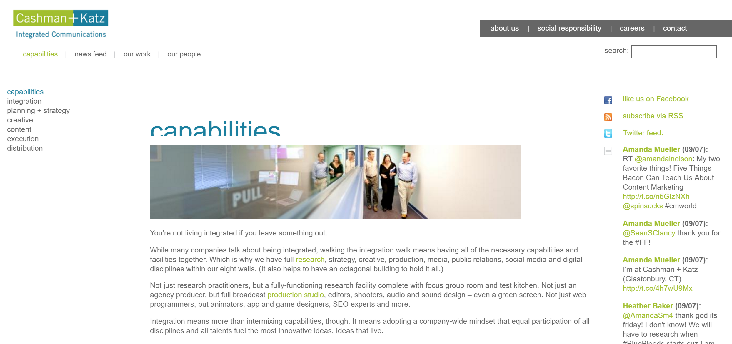 For my second website for the agency we all decided to do it without Flash, make it more content-driven, and make it a collaborative effort among everyone at the agency. To that end the design team went with a minimal, typography-driven design, and I implemented that design on Drupal. The site was our lowest priority, after all of our clients, so it took a long time. It was an enormous education, and I got a ton of great experience with Drupal, which became our platform of choice when building CMS-based sites for clients.
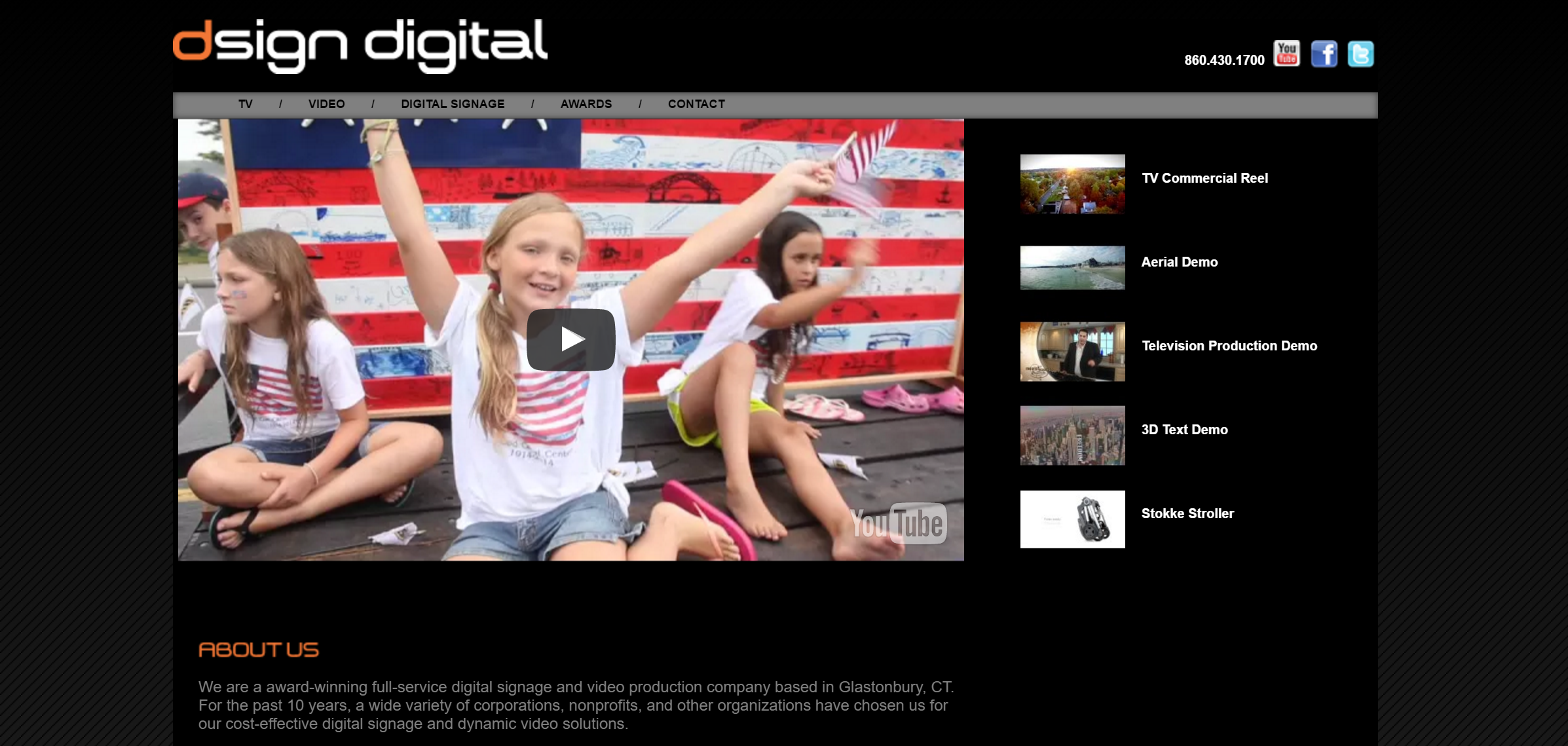 I was given this design to implement, with the sole limitation that I could not rely on Flash.
The challenge here was creating the video gallery, which I did using JavaScript and PHP. The list of videos to the right is actually not connected in any real way to the video player on the left—the list on the right is generated automatically from a list of video ID's curated by the administrators. When one of them is clicked, this triggers a bit of JavaScript on the left side to unload the video currently being played, load the new video into the player, and begin playing. The video uses the stock YouTube embed code, so it will play on mobile devices using HTML5. All in all this was a great education, and beat dealing with YouTube's APIs any day.
The diagonal pinstripes in the background were done using the trusty old background-repeat CSS property, using a small transparent PNG file to create the lines. Underneath it is a CSS3 gradient, giving what I think is a cool effect for very little bandwidth.
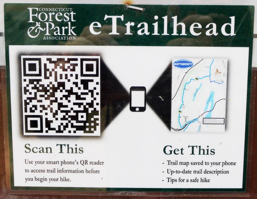 A friend of mine volunteers with the Connecticut Forest and Park Association, and approached me for help with this project a year or so ago. Almost right away I wanted to get involved. The basic premise is that hikers can scan a QR code posted at a trailhead kiosk, and view trail information, alerts, maps, and so on. When the hiker scans the code initially, they are given some general information about CFPA, but to get the trail-specific information they have to enter an e-mail address, which triggers an e-mail containing that address to the person maintaining the CFPA's mailing list.
Knowing we wanted to create something that the CFPA could maintain and use independently of a developer, I elected to build it on Drupal, creating a theme from scratch to handle mobile devices. The back end automatically creates a printable QR code when a trail is added, so the entire process is as automatic and simple as possible. They tested the concept on one trail at first and initial feedback was very positive, with a lot of addresses added to the mailing list. Overall, this has been one of my favorite projects.
Some time later, eTrailhead was even featured on the local news, on WFSB and NBC. As a quick postscript, doing this is now a very common practice, so we were pioneers!
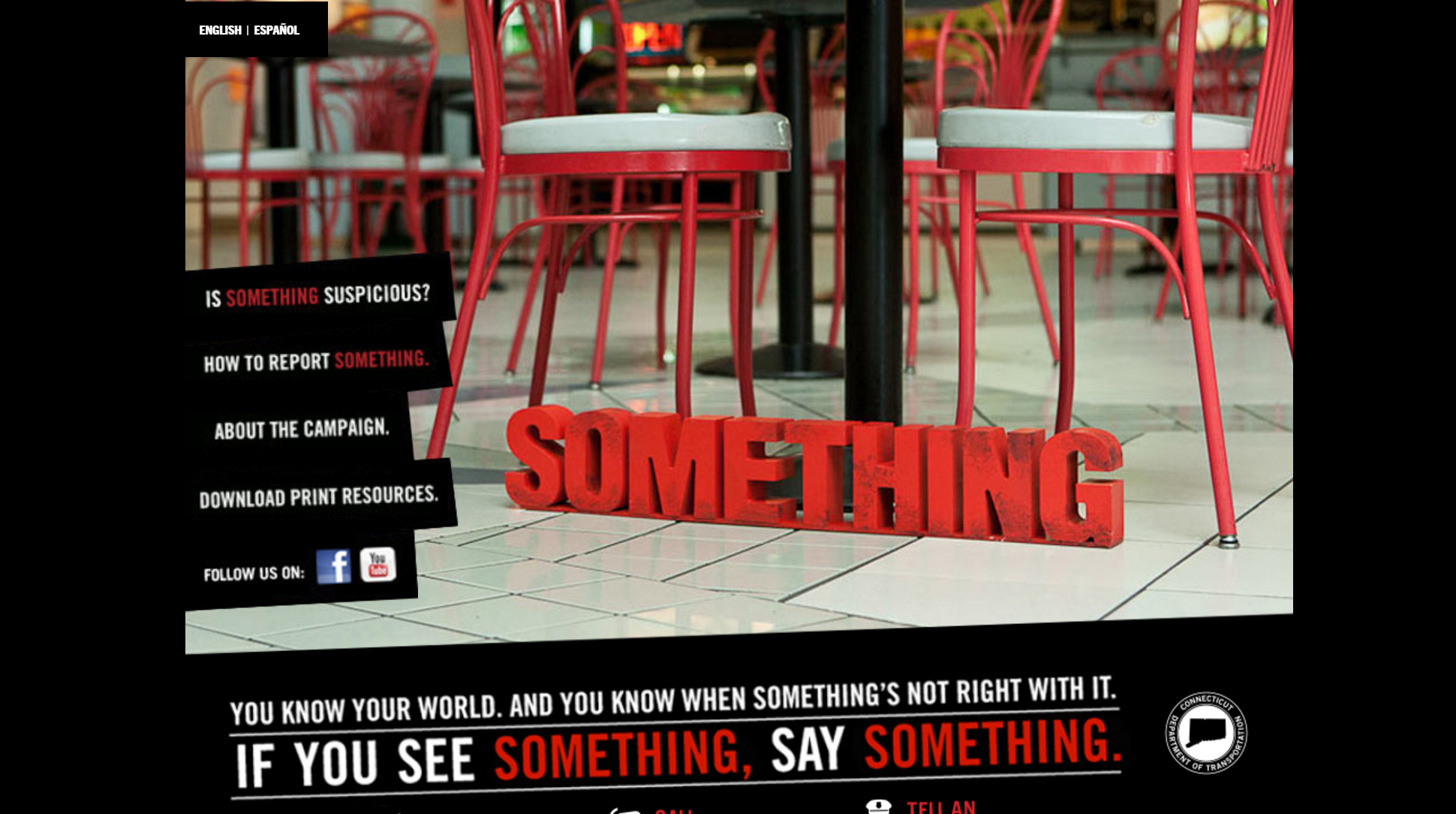 This was our second crack at the See Something, Say Something site. For this one they wanted a slideshow of images behind the page, taken from our video shoots, with the same diagonal box navigation on the left as before. They also wanted it to be compatible with IE6, and done in ASP. These last two requirements came to light after it had already been done using CSS3 for most of the rotation and text effects, and PHP.
The real challenge turned out to be the nav bars on the left, which had been very easy to do in CSS, and would have been easy enough to redo with transparent PNGS—but IE6 fights hard with PNG transparency, and any workaround filters make using them for navigation sort of useless. So, there's server-side code in the background that detects users on IE6 and serves them transparent gif's instead. The edges are more jagged, but the whole thing renders perfectly in IE6 otherwise, so it was a good compromise.
 This was a neat opportunity and another cool Dan Sullivan design. The interesting part here was that this very non-traditional design had to be incorporated somehow into a CMS. My work with Drupal led me in that direction, so this site is entirely built as a Drupal 7 theme, using Cufón for font replacement and JScrollPane to get a nice scrollbar. To me this site really shows just how versatile and flexible Drupal can be. The client can easily change any of the content, or add new sections and menus. While the design is more easily broken by a long menu or title than a more traditional theme would be, it still has most of the same functionality.
This was also an experiment of sorts, because I had never used D7 for a production site before. Two of the challenges were moving it when we were ready to launch and getting JScrollPane to work. My documentation on these issues seemed to help a lot of other people experiencing the same problems, and became the most popular pages on my site.
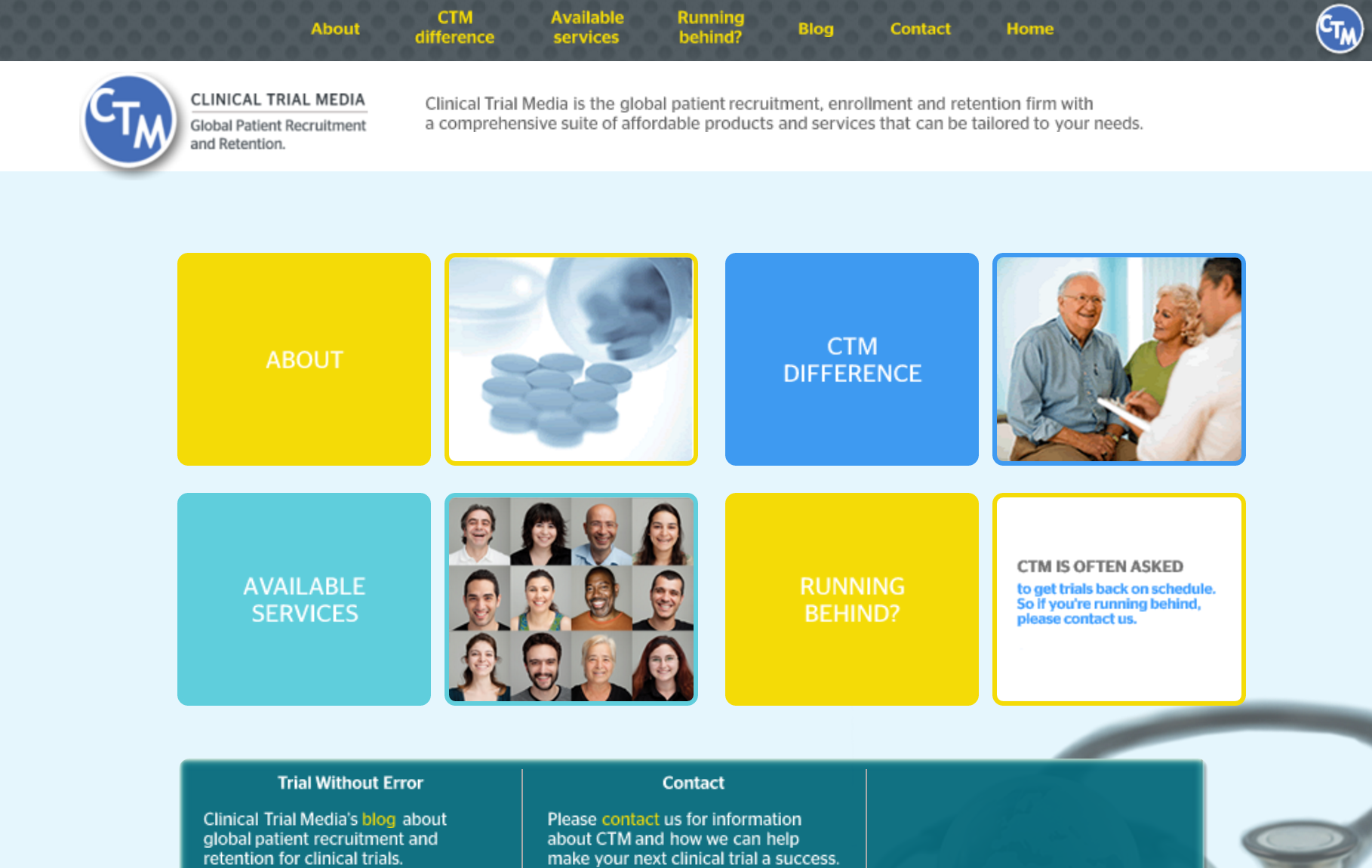 This was a site I programmed for Switch Brand Innovation. It has a number of neat elements to it—the rollovers are all done with PNG sprites, the round corners with CSS3, rich typography with Cufón, and more stuff I'm sure, I just can't think of them right now. All the aligning and padding and margins were important and had narrow tolerances, so there's a pretty involved network of conditional IE sheets; but all things considered it came out very well.
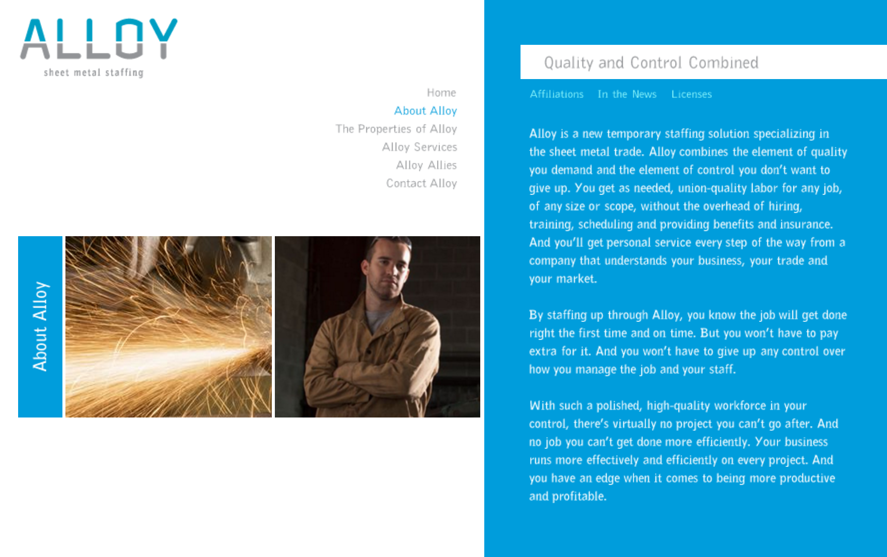
 This was another site I created for Switch when I was working freelance. As with many of the other sites on this page, I was handed a PhotoShop file and asked to replicate it in code. Much like CTM, there was a clear easy path of using sliced images, but I took it as a challenge to do as much of the heavy lifting with CSS as possible.
The result was somewhat mixed. Text rotation and font replacement were not reliable enough across the target browsers to do it without images, so there are a lot of PNG sprites. Still, I was able to make it pretty efficient and it hews very tightly to the original designer's vision, and it's an effective site.
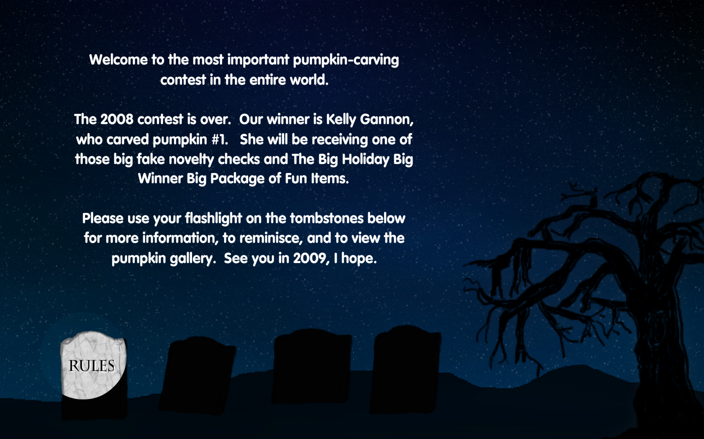 Here's a perfect example of how I go about doing projects: I wanted to learn ActionScript 3, so I decided to create a pumpkin-carving contest. The following year I moved the contest to Facebook for ease of administration and to encourage more entries, but the original site remains one of my favorites. The real fun was in creating the fog effect and the flashlight navigation, and one of these days when I have a lot of time I'd like to try to replicate it without Flash.